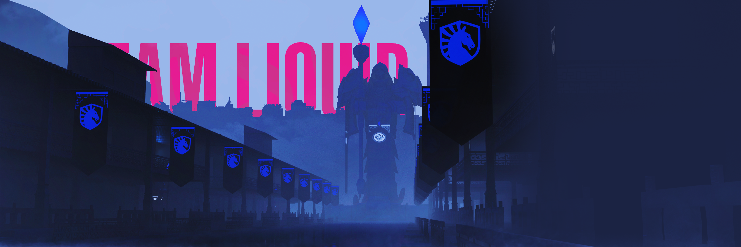
The Mid Season invitational is one of the most prestigious tournaments in League of Legends. In 2024 the host city was Chengdu, China and Team Liquid qualified convincingly for the event.
As a senior graphic designer for Team Liquid I was charged with leading the visual direction for our social media communications surrounding the Mid Season Invitational. A yearly international competition where the best teams from each region compete in a shorter format than the World Championship later in the year.
The tournament took place in May of 2024 in Chengdu, China.
Our aim was to authentically include the region where the tournament is held in a way that embraces the competition aspect and brings elements from the game in a new context.
We are also consciously including the brand guidelines of the tournament to create proximity to existing communication from the tournament organizers.
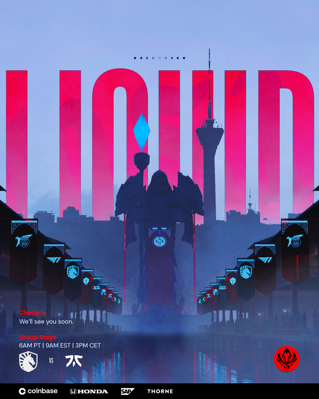
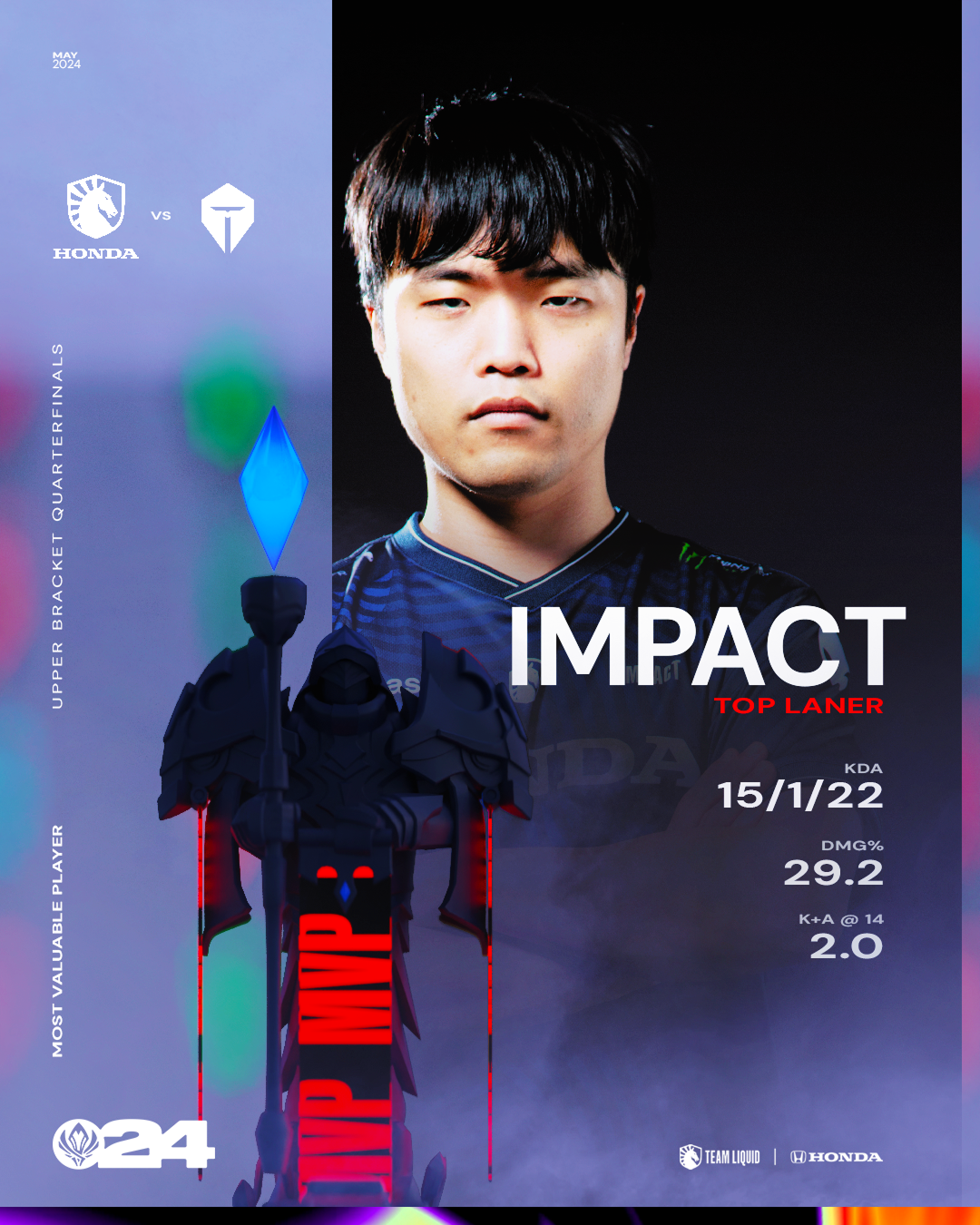
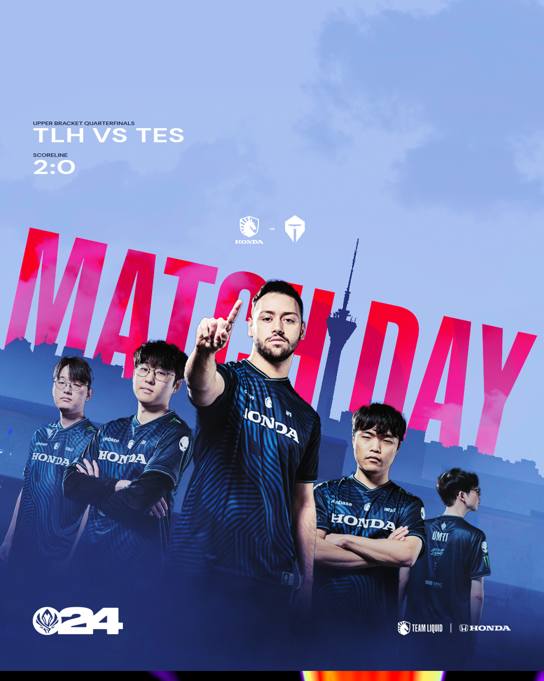
To our team it was important to remain sensitive and deliberate in our development of assets, this includes the depiction of architectural aspects & ornate details we decided to include in our design direction.
I was responsible for the sourcing & development of everything that was included in the graphics outside of the player photography which was done by the photography team for general coverage throughout the year.
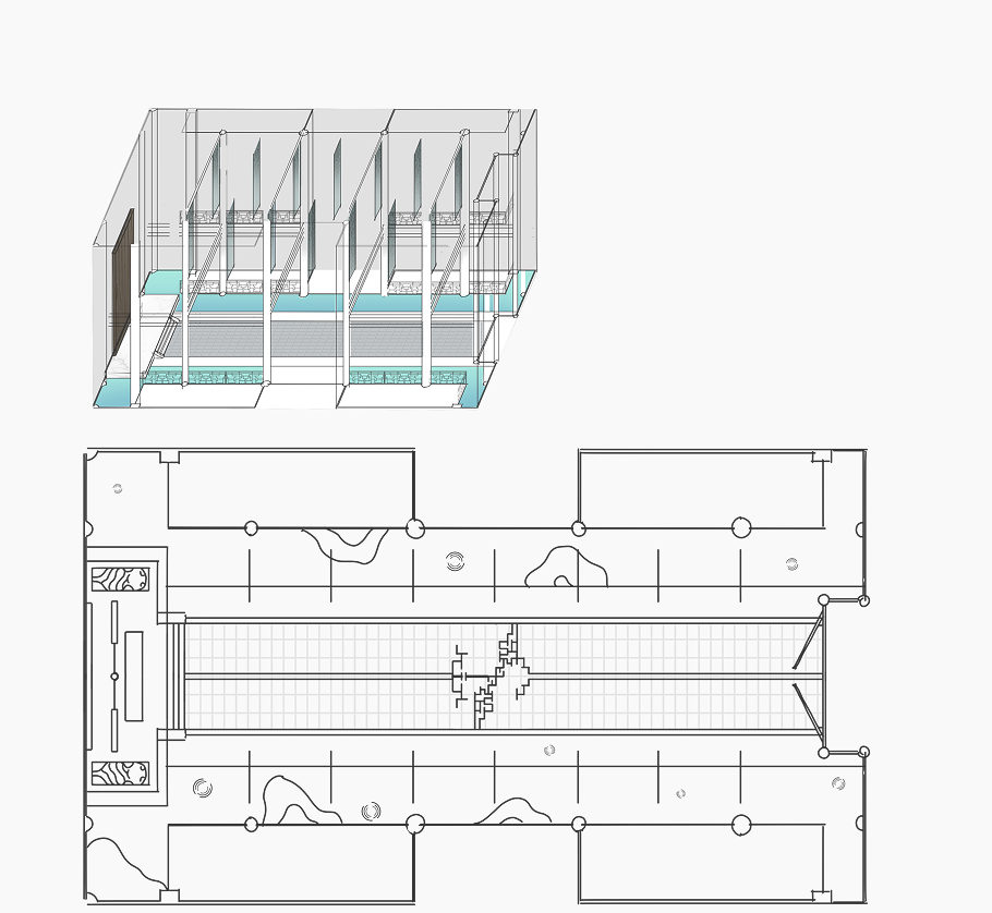
The initial vision was to have a ceremonial series of halls that would evolve over the course of the tournament to reveal more ornate spaces, gardens & in the end a very elaborate altar of the throne for the winner of the tournament. Each room would contain banners of the competing teams and matches and depict the road to the final placement in the surroundings of the photography.
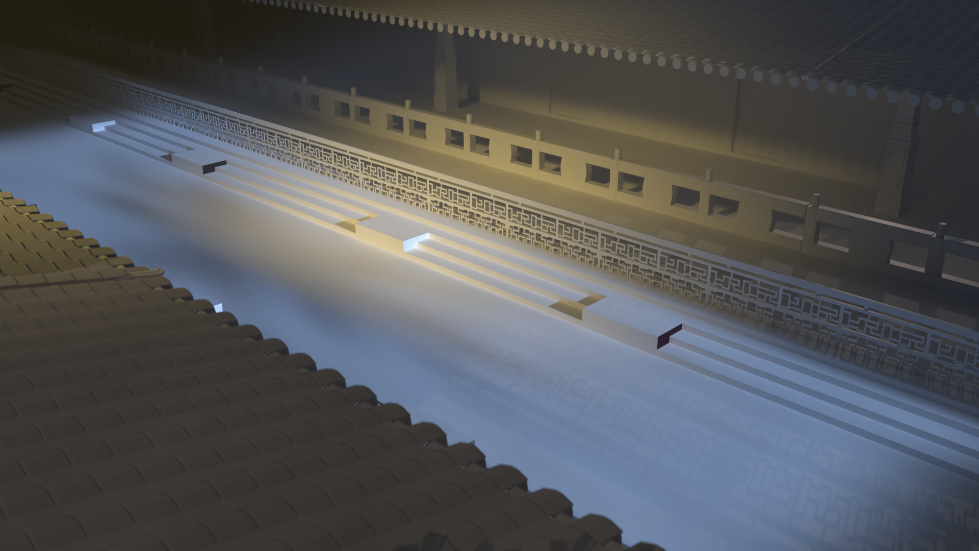
The “block-out” phase for our asset creation showed us how challenging and resource intensive it would be to change the environment for each stage of the tournament and thus we kept the identity of the environment but culled some of the narratively interesting details to make sure we could realize our creative vision in a way that honored the intention but was practically achievable with the available resources.
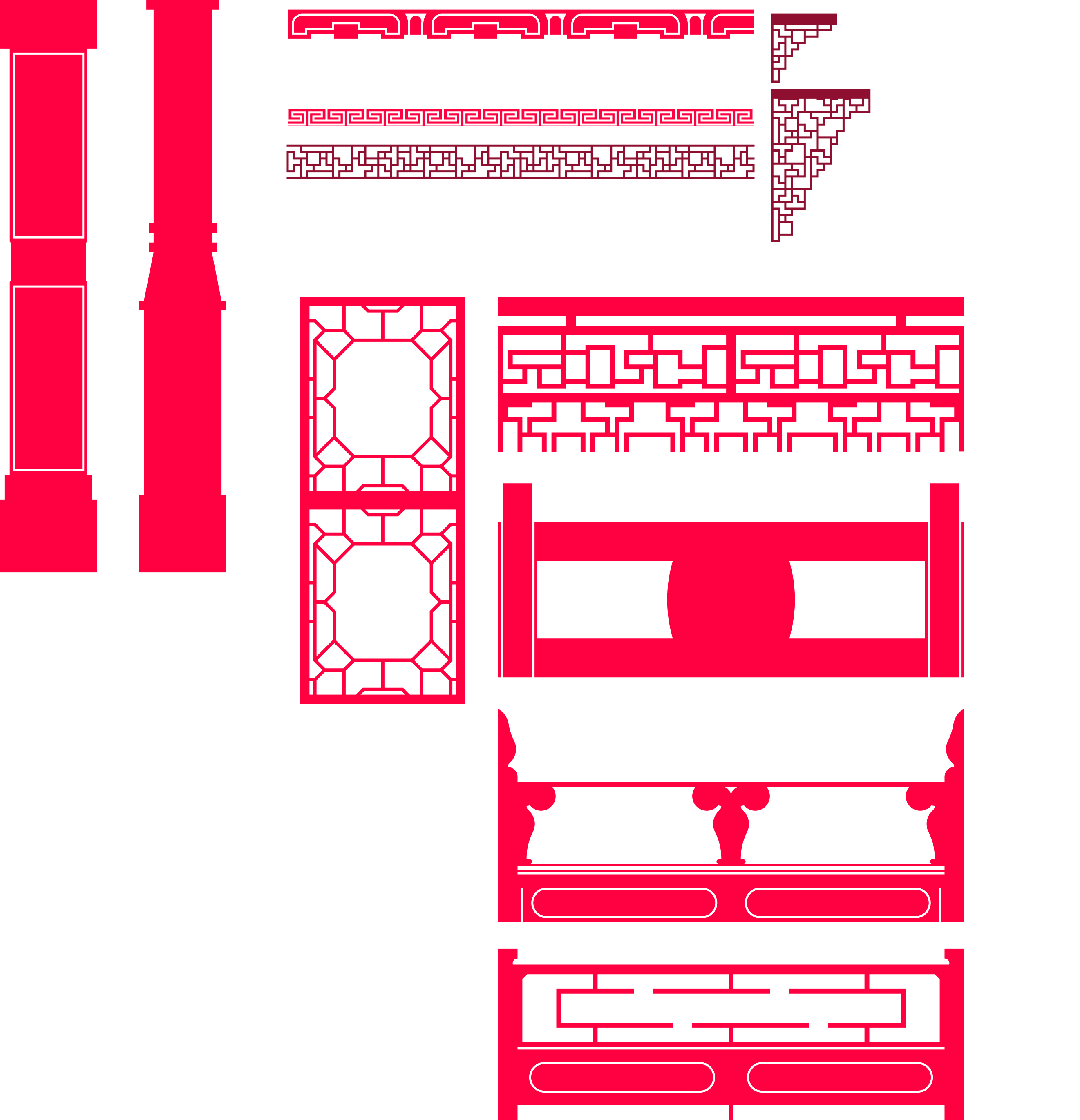
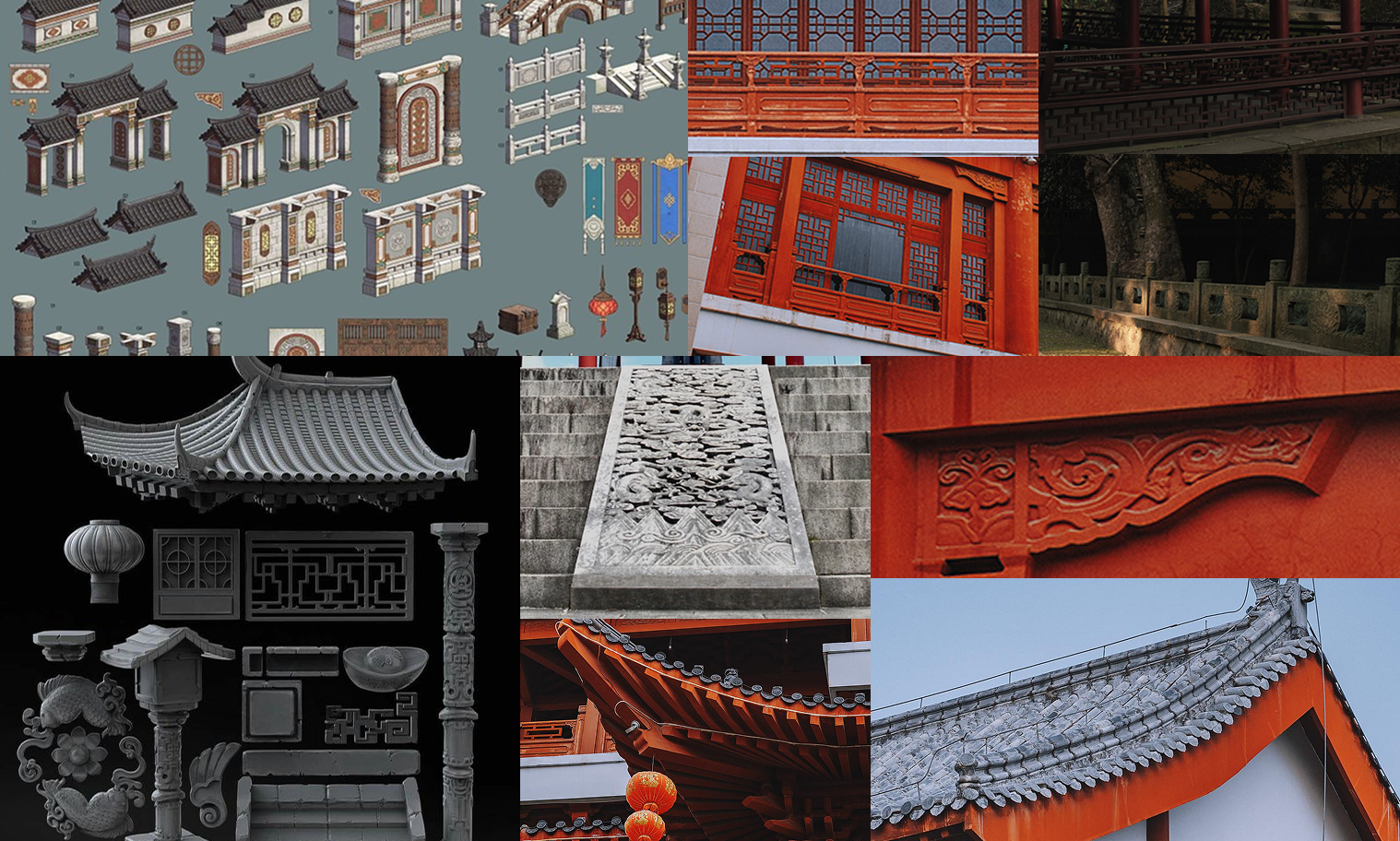
I had recently returned from a personal trip to China and had been quite obsessed with the artisanship in the fences in palaces & gardens. These were my jumping off point for creating an environment that paid homage to these magical spaces that had charmed me just weeks prior to starting this project.
After gathering reference material and studying what made them identifiable to an audience I got started blocking out a ceremonial environment that felt like it had that competitive intensity found in the visual identity of the tournament organizers for the tournament.
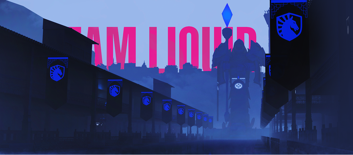
The result was this versatile set that was modular & was capable of adapting to the needs of different social posts, a visually enticing graphic application in a very intense mood that felt fitting to the tournament.
The visuals narratively weren’t able to evolve much because of the team not making a deep run in the competition, but the visuals were well received among fans of the team and the audience of the competition.
Incredibly designer that executed on our complex vision and arrived at an incredible brandable logo. Since working with him our logo has been displayed internationally and in-game both to the immediate recognition of our fans. It is a brand mark we are proud to stand behind and have represent us!
Hendrik has a great eye for detail and the ability to take a brief to new heights. In my collaborations with him he consistently delivered, and in many cases brought forward ideas that changed how we looked at the project overall. Hendrik is versatile, patient, and above all an excellent artist who'll elevate whatever mandate you throw at him.